Color Schemes • Back to Design page
Any design you see—in a store, in clothing, in artwork, or in a web site—will have carefully-chosen colors used in a consistent way. Colors are rarely chosen casually, and they are usually used in a consistent way.
Every web site has a color scheme: a set of carefully selected colors which are used meaningfully on a web site. For this web site, the colors are red, green, and blue: the primary colors of light. Text is black, and the background is a light image, ranging from light gray to white.
Color schemes are usually chosen in a certain way. Colors may be chosen because they are the colors already chosen for an organization. For example, Lakeland College uses the colors dark blue and gold; thus, you will see these colors as the main ones used in its web sites and logos.
Countries have colors; in America, it is red, white, and blue; in Japan, it is red and white. In Spain, red and yellow; and so on. These colors are often used to create a patriotic feeling.
You can also choose colors based upon an organization's purpose. For example, an organization which deals with nature may use browns, greens, and blues (soil, plants, and water & sky). A soccer organization may choose grass green, white, and black (a playing field and the colors of a soccer ball).
Another way to choose a color scheme is based upon an image. If you feature one image as representing your organization, the colors in that image may give you your color scheme set. For example, if you have a Scuba club, and you use an image of someone at a resort beach, the colors of the water and features of the sea floor may become your color scheme.
You can also use colors based upon their accepted meanings. For example, red is considered important, energetic, or alarming, but is also associated with both love and war; blue is a favorite color, considered peaceful and trusting; green is the color of nature and growth, and can be soothing; and so on. You might select your colors based upon a variety of interpretations.
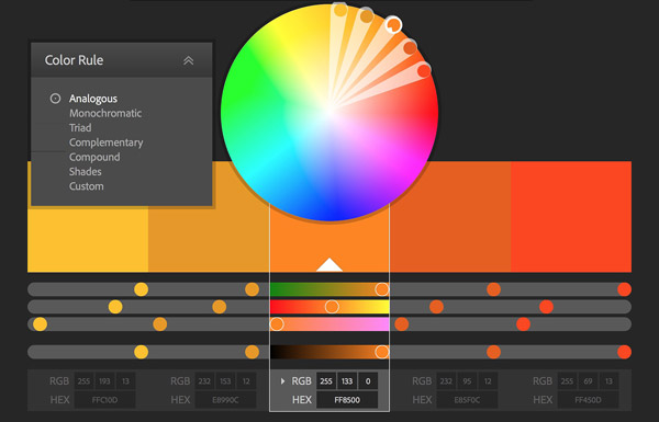
One more way is to use colors based upon the color wheel. In this technique, you choose a main color, and then choose others based on that color. The basic patterns are:
- Monochromatic: choose a single color, and use light and dark versions of that color (for example, light to dark blue).
- Analogous: choose a color, then use colors based on that and colors very close on the color wheel (for example, red, orange, and yellow).
- Complementary: use two opposite colors, such as red and green (Christmas colors), or blue and orange (Amazon.com)
- Split complementary: use two opposite colors, and the colors next to one of those. For example, blue & orange (opposites) along with red and yellow (close to orange).
- Triadic: use three colors equally distant from each other, such as red, green, and blue (this site!)
- Tetradic: use four colors, two pairs of opposites (e.g., red & green, blue & orange). Googe and Microsoft use such schemes.
Two very good sites for exploring these colors schemes are Adobe's "Kuler" Color CC page, or Paletton's Color Scheme Designer.
There are less "professional" techniques for choosing colors. For example, Facebook uses mostly blue because the site's creator, Mark Zuckerberg, is color blind, and cannot see red and green well. He sees blue very well, however, and so used a range of blues for his site.
Contrasts
Most web sites use a light color, white or light gray, for their background; most also use a dark color, black or dark gray, for their text colors. Many web sites, however, use a light gray background and a dark gray text color.
Why? Because, while great contrasts can be lively and attractive, too much contrast can hurt people's eyes after a while. For me, personally, white or bright yellow on a black background are extremely annoying. Some people feel the same way about black text on a white background.
To solve this problem, colors which are a little less bright and a little less dark are used. Most people don't even notice it, but the difference can be dramatic. Note the text colors used in the famous web site color schemes shown below; few sites use pure black.
Can you guess which well-known web sites have these color schemes?
The answers will be revealed if you hover your cursor over the "A" in the circle—but don't cheat! Really try to guess the web site! Or, at least, guess what kind of web site. If you hover your cursor around the text colors, a hint may appear sometimes.